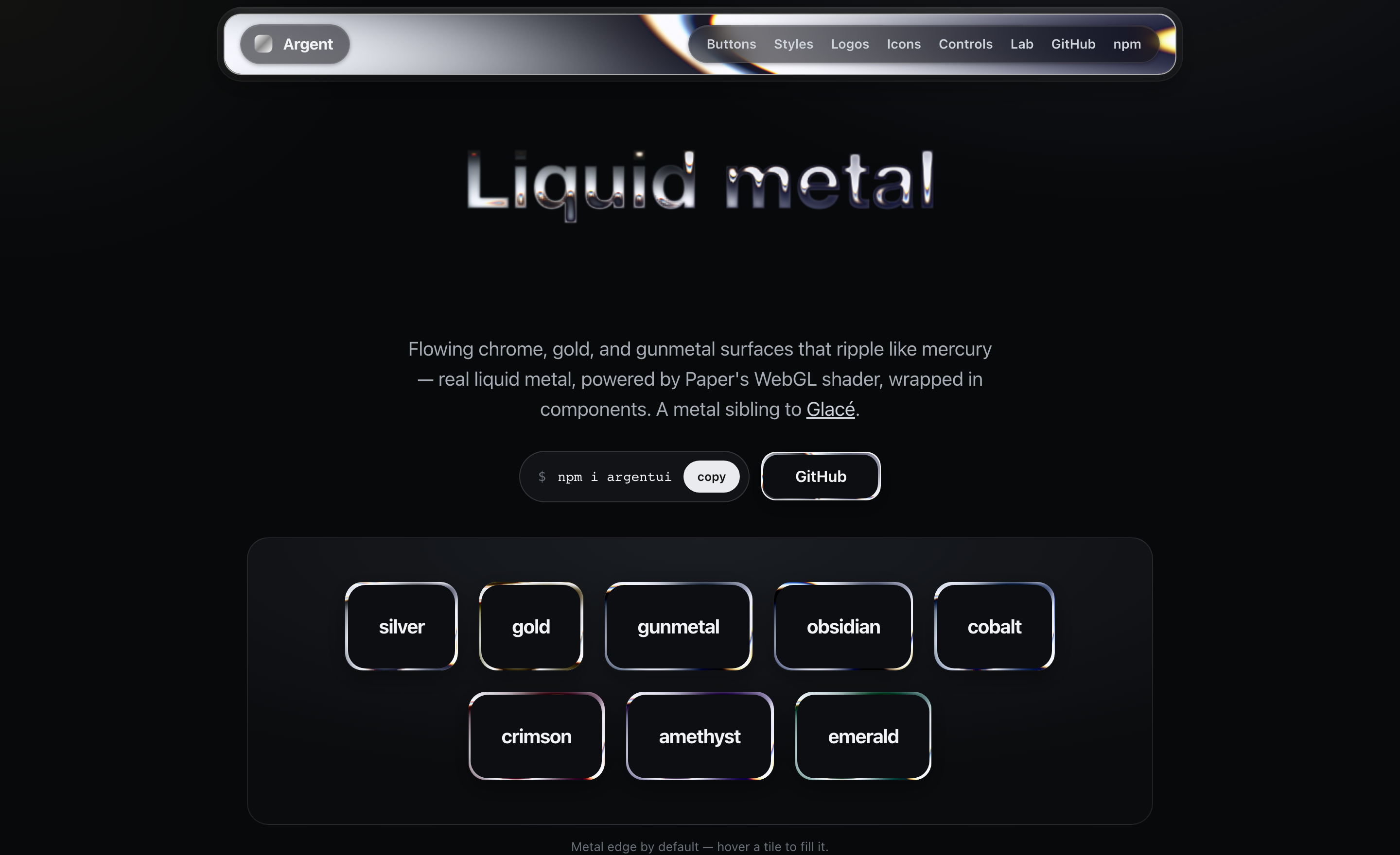
Liquid-metal UI for React. Flowing chrome, gold, and gunmetal surfaces that ripple like mercury — real liquid metal, powered by Paper's LiquidMetal WebGL shader, wrapped in components. A metal sibling to Glacé.
npm i argentui @paper-design/shaders-react
@paper-design/shaders-reactis a peer dependency — install it alongsideargentui. It's the WebGL shader engine, by Paper, licensed under PolyForm Shield.
import { MetalButton, MetalCard, Metal } from "argentui";
import "argentui/styles.css";

<MetalButton tone="silver">Get started</MetalButton>
<MetalCard tone="gunmetal" sheen>Forged in the browser</MetalCard>Each surface renders Paper's LiquidMetal shader with shape="none" so the metal fills the whole element instead of painting a blob. The shader canvas sits behind your content, clipped to the surface's radius. A tone is just a tuned set of shader params (colorBack, colorTint, repetition, distortion, shiftRed/Blue, …). Until the canvas mounts on the client, a static CSS gradient stands in (SSR-safe).
Each surface is its own WebGL canvas, and browsers cap concurrent WebGL contexts (~16). Argent handles this for you: the shader only mounts while a surface is on/near screen (IntersectionObserver) and releases its context when it scrolls away, so a long page stays well under the cap. The static gradient shows in the meantime.
By default the metal is just the edge (variant="border") with a calm interior, which keeps content readable; pass variant="fill" for a full molten surface, or revealOnHover to fill in on interaction.
A stamped-metal button: readable at rest with a liquid-metal rim, molten on hover, with a real press (and haptics on supporting devices).
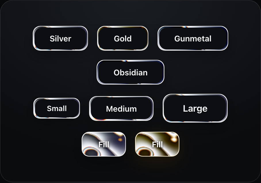
<MetalButton tone="gold" size="lg">Buy</MetalButton>| prop | type | default |
|---|---|---|
tone |
MetalTone (8 finishes — see Tones) |
"silver" |
size |
"sm" | "md" | "lg" |
"md" |
speed |
number |
1 |
A padded liquid-metal panel.
<MetalCard tone="gunmetal" sheen>
  <h3>Title</h3>
  <p>Any content — the metal flows behind it.</p>
</MetalCard>Metal type. By default the liquid-metal shader is poured into the glyphs — flowing bands, liquid edges, chromatic fringe. Set variant="outline" to run the metal around the edges of each glyph over a dark or gradient interior — the border treatment, for type. The CSS chrome gradient stands in until the shader loads (and wherever WebGL is unavailable); pass shader={false} to use it on its own, free at any scale.

<MetalText tone="silver" fontSize={64}>Quicksilver</MetalText>

// metal edges, dark gradient interior
<MetalText variant="outline" fillGradient={["#23262c", "#0a0b0d"]} fontSize={64}>
  Quicksilver
</MetalText>

<MetalText shader={false} tone="gold" style={{ fontSize: 64 }}>Solid gold</MetalText>  // pure CSS
Shader mode renders the glyphs into an SVG silhouette, which sees system fonts only by default. To use a webfont (e.g. Google Fonts), pass
fontCsswith an@font-facewhosesrcis a data: URI — it gets embedded in the silhouette and renders correctly (the argentui.com text lab does exactly this). The CSS gradient stands in until the shader loads, and wherever WebGL is unavailable.
Pour the metal into any mark — pass an image with a transparent background and it flows inside the silhouette.

<MetalLogo src="/logo.svg" tone="silver" size={170} />Pour the liquid-metal shader into any SVG icon — a lucide-react or Heroicons element, raw SVG, or a URL. React icons are serialized from the DOM to a silhouette; each icon is one WebGL canvas, gated to the viewport like every metal surface.
import { MetalIcon } from "argentui";
import { Sparkles } from "lucide-react";
import { BeakerIcon } from "@heroicons/react/24/solid";

<MetalIcon icon={<Sparkles />} tone="silver" size={32} />
<MetalIcon icon={<BeakerIcon />} tone="gold" size={64} />
<MetalIcon svg="<svg>…</svg>" />          {/* or raw SVG */}
<MetalIcon src="/icon.svg" tone="gunmetal" />  {/* or a URL */}
Buttons take an icon prop too — it renders before the label in the label colour:
<MetalButton tone="silver" icon={<Sparkles />}>Get started</MetalButton>| prop | type | default |
|---|---|---|
icon / svg / src |
ReactNode / string / string |
— |
tone |
MetalTone |
"silver" |
size |
number |
32 |
A mercury switch (the thumb squishes as you press it), a molten progress bar, and metal-rimmed badges.
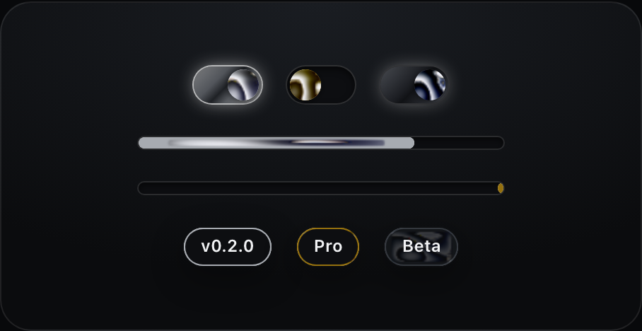
<MetalToggle tone="silver" defaultChecked onCheckedChange={setOn} />
<MetalProgress tone="silver" value={64} />
<MetalProgress tone="gold" />  {/* indeterminate */}
<MetalBadge tone="gold">Pro</MetalBadge>The base primitive every component is built on. Render any element via as.
<Metal as="nav" tone="silver" radius={16} speed={0.5} sheen>…</Metal>| prop | type | default | notes |
|---|---|---|---|
as |
ElementType |
"div" |
element/component to render |
tone |
MetalTone |
"silver" |
finish (8 tones — see below) |
variant |
"border" | "fill" |
"border" |
metal edge only, or full surface |
frame |
"single" | "double" |
"single" |
double adds an inner hairline frame |
tint |
boolean |
false |
let the metal show faintly through the interior |
revealOnHover |
boolean |
false |
fill with metal on hover (border variant) |
borderWidth |
number |
1.5 |
rim thickness (border variant) |
radius |
number |
14 |
corner radius (px) |
speed |
number |
1 |
shader speed (0 pauses) |
finish |
"surface" | "button" | "bar" | "orb" | "rim" |
per component | shape-tuned shader preset (see below) |
effect |
"flow" | "molten" | "ripple" | "chrome" | "wave" |
"flow" |
the liquid's motion character — from mirror-still chrome to a heavy molten churn |
halo |
boolean | number |
false |
frosted standoff ring outside the metal — a few px of backdrop blur finished with a ~5% hairline (true = 8px; theme the line with --argent-halo-line) |
angle |
number |
per tone/finish | band direction in degrees |
metalScale |
number |
per finish | pattern scale — higher spreads the bands |
sheen |
boolean |
false |
specular streak on hover |
Theme the border interior with the --argent-panel CSS variable.
Eight metal finishes: silver, gold, gunmetal, obsidian, and the coloured metals cobalt (blue), crimson (red), amethyst (purple), and emerald (green). Every component takes tone.
<MetalButton tone="cobalt">Blue steel</MetalButton>
<MetalCard tone="amethyst" />
<MetalText tone="emerald">Emerald</MetalText>
Tune any tone's shader params via TONE_PARAMS.
One shader tuning can't serve every shape — broad bands that look right on a card read as a smear on a 10px progress bar and a sticker on a 22px toggle thumb. Each component defaults to a finish preset tuned for its geometry, and you can override it anywhere:
| finish | tuned for | character |
|---|---|---|
surface |
cards, nav, panels | broad flowing reflection bands |
button |
buttons | spread + calmer warp, label stays readable |
bar |
thin strips (progress) | near-vertical stripes crossing the bar |
orb |
small round things (toggle thumbs) | one soft highlight, like a polished sphere — with per-instance angle variation so rows don't look cloned |
rim |
hairline edges (badges) | dense bands so any visible slice catches light |
<Metal tone="silver" finish="rim" angle={120}>…</Metal>Tune any tone with TONE_PARAMS, or drop down to <MetalFill> / Paper's <LiquidMetal> directly for full control.
Argent also ships its own clean-room WebGL2 shader — pass engine="native" to any surface to use it instead of Paper's. Same recipe (reflection banding, noise flow, chromatic dispersion), zero extra dependencies, MIT all the way down. It currently powers the rim/border look best; the Paper engine remains the default.
<Metal tone="silver" engine="native">…</Metal>The shader pauses under prefers-reduced-motion; toggles are real role="switch" buttons; progress bars carry role="progressbar" with values; labels keep WCAG-ish contrast on every variant. Haptics (navigator.vibrate) fire on press where supported — disable globally with setHaptics(false).
Liquid-metal shader by Paper (@paper-design/shaders). Argent is the component layer, motion, and theming on top.
MIT © Sean Geng. The bundled shader engine (@paper-design/shaders-react, a peer dependency) is licensed separately under PolyForm Shield by Paper.