
A sleek, interactive, and highly flexible bottom menu component built with React and Bootstrap 5. Designed to bring a modern, OS-level navigation experience to web applications with minimal setup.
🔗 Repository Link: https://github.com/Naganen/react-js-dock-menu
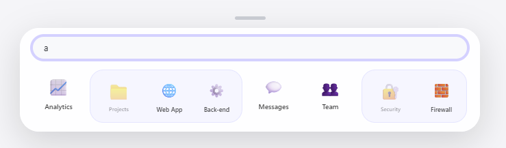
- Hybrid Search Engine: Advanced real-time filtering that identifies matches in both top-level and nested items. Matching sub-items are intelligently grouped into a sleek "Search Capsule" next to their parent folder.
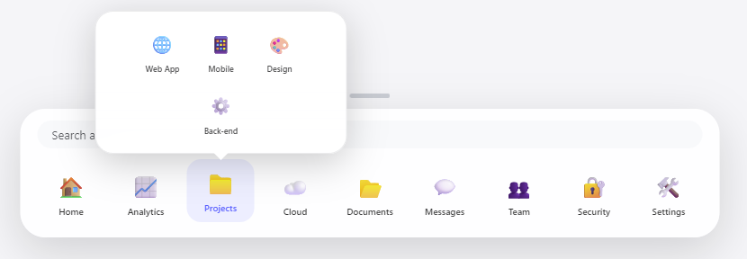
- Adaptive Folder Pop-overs: Features a smart window system that opens sub-menus directly above the active icon. The window is horizontally centered and uses a high-priority z-index to stay on top of all other elements.
- Persistent Icon Placement: Unlike standard flex layouts, opening a folder or searching does not shift the position of existing icons, maintaining muscle memory for frequent users.
- Smart Folder Access during Search: If a folder name matches a search term but its children do not, the folder remains interactive, allowing users to manually explore its contents while still in search mode.
- Responsive Grid Wrapping: Built with a "Wrap-First" logic; both the main dock and the sub-menu windows automatically adjust their layout to fit smaller screens, preventing horizontal overflow.
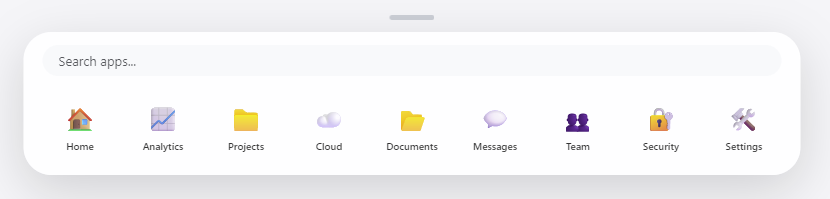
- MacOS-Inspired "Notch" UI: Includes a refined, centered notch that serves as a visual anchor and indicates the interactive state of the dock.
- Glassmorphism Aesthetics: Utilizes high-end CSS
backdrop-filter: blurand optimizedrgbalayering to provide a modern, translucent OS-level feel. - Focus-Lock Mechanism: Sophisticated
useRefandmousedownhandling keeps the menu expanded during complex interactions, such as searching or browsing deep folder structures.
📁 Closed State

📂 Open State
📂 Folders & Sub-menus
🔍 Integrated Search
Ensure you have Bootstrap 5 available in your project for layout utilities:
npm install bootstrap
Simply import the component and provide your configuration via the menuData prop:
import React from "react";
import DockMenu from "./DockMenu";

const myMenuData = [
  { id: 1, name: "Home", icon: "🏠", link: "/" },
  { id: 2, name: "Analytics", icon: "📈", link: "/analytics" },
  {
    id: 3,
    name: "Projects",
    icon: "📁",
    isFolder: true,
    children: [
      { id: 31, name: "Web App", icon: "🌐", link: "/projects/web" },
      { id: 32, name: "Mobile", icon: "📱", link: "/projects/mobile" },
      { id: 33, name: "Design", icon: "🎨", link: "/projects/design" },
      { id: 34, name: "Back-end", icon: "⚙️", link: "/projects/server" },
    ],
  },
];

function App() {
  return (
    <div className="App">
      {/* Your content */}
      <DockMenu menuData={myMenuData} />
    </div>
  );
}

export default App;The menuData prop accepts an array of objects with the following structure:
| Property | Type | Description |
|---|---|---|
id |
number/string | Unique identifier for React rendering. |
name |
string | The label displayed under the icon. |
icon |
any | Any renderable content (Emoji, SVG, Image, etc.). |
link |
string | The target URL for navigation. |
isFolder |
boolean | Set to true to enable sub-menu functionality. |
children |
array | (Optional) List of items to be displayed inside a folder. |
- React (Functional Components, Hooks:
useState,useEffect,useRef) - Bootstrap 5 (Layout and form utilities)
- CSS3 (Backdrop-filter blur, custom cubic-bezier transitions, and flex-grid)
The menu utilizes a Click-Outside listener and a Focus-Lock mechanism. This ensures that the menu remains stable and open while the user is actively searching or browsing folders, preventing accidental closures during precise interactions.
MIT License © Naganen